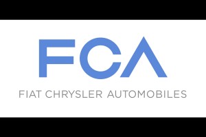
As Bob Dylan once let us know: The times, they are “a’ changing.” In this case, the times are ushering in a new chapter of Chrysler’s history. The American automaker has merged with Italy’s Fiat, creating a new parent company for the many brands and models now under one umbrella – Fiat Chrysler Automobiles.
Robilant Associati, an Italian logos and branding designer, helped F.C.A. create a logo that reflects the direction and priorities of the company.
As explained by Fiat Chrysler Automobiles, the logo has symbolic meaning: “The three letters in the logo are grouped in a geometric configuration inspired by the essential shapes used in automobile design: the F, derived from a square, symbolizes concreteness and solidity; the C, derived from a circle, representing wheels and movement, symbolizes harmony and continuity; and finally, the A, derived from a triangle, indicates energy and a perennial state of evolution.”
The crossbar of the “A” was removed, which provides some latitude for creative conjecturing with regards to its meaning. Perhaps it symbolizes an arrow, indicating the rise of standards, innovations, and sales of the automobiles? Or maybe the meaning lies in Knuth’s up-arrow that represents exponentiation – an exponentiation of quality, care, safety, or features of F.C.A.’s lineage?
Regardless of its meaning, it’s safe to assume that with the lauded unveiling of the new Chrysler 200 and an 8% increase in sales for Jeep Grand Cherokees, the newly merged automaker will capitalize on a revitalized inventory and surging consumer base.
In fact, we encourage you to check out AutoPark Chrysler Jeep just a few miles outside of downtown Raleigh. Located in Cary, this dealership has an immaculate showroom to display the finest models and an expansive lot for you to find the perfect vehicle.


Comments are closed.